Nano Banana 2 Text in Images: Ad Typography That Actually Reads
Everyone is talking about nano banana 2 text in image after Google’s own demos pushed typography hard. I care about banner ads and posters that a human can actually read on Generate.
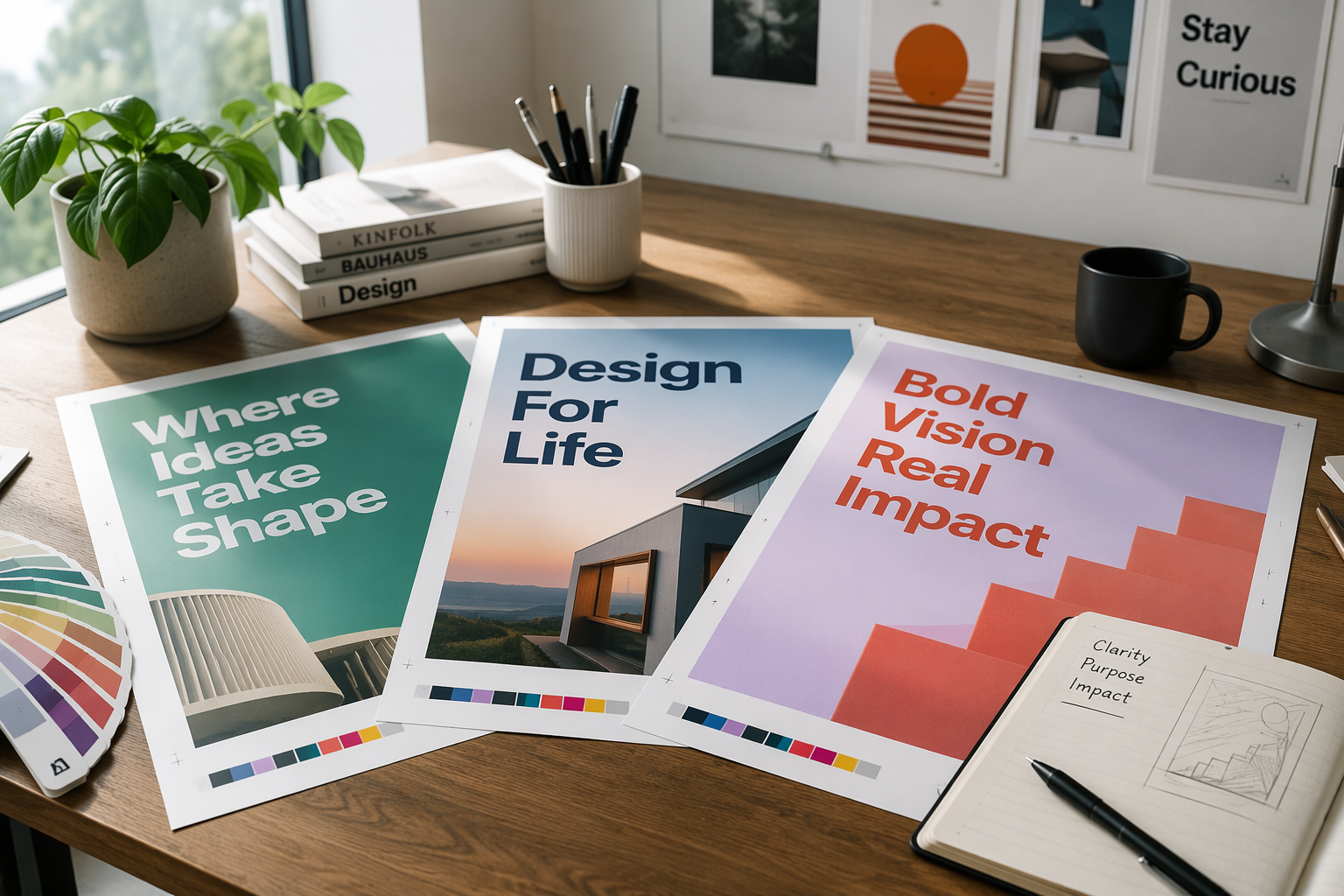
TL;DR
| Rule | Why it helped me |
|---|---|
| Put copy in quotes | Model treats it as exact text |
| Name font vibe | “bold condensed sans” > “nice font” |
| Fewer words | 2–6 words beat paragraphs |
| Leave negative space | Layout survives crop |
Prompt pattern that worked
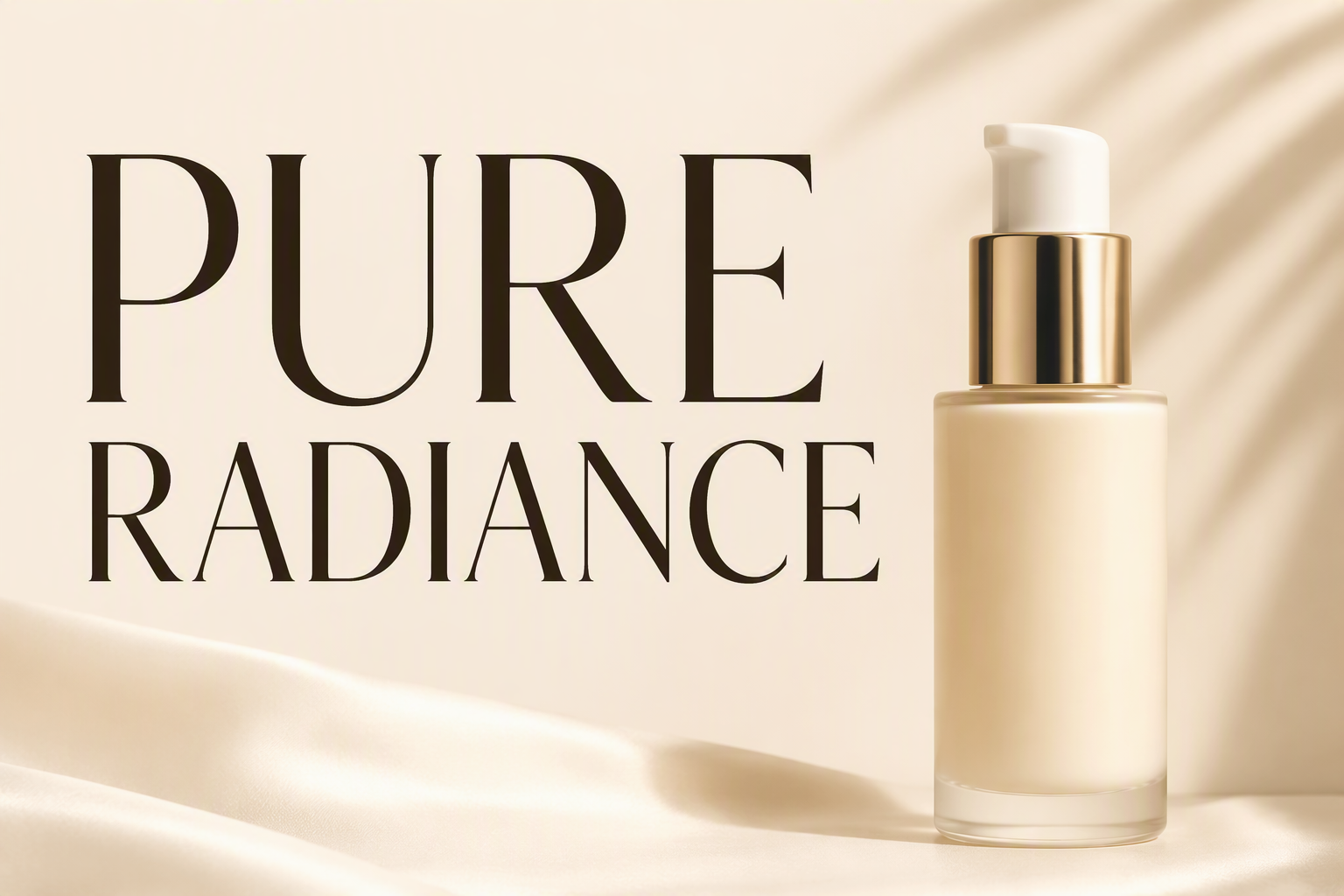
Magazine ad, product on right, large headline "PURE RADIANCE" in bold condensed sans-serif, small subline "Clean skincare for real skin", cream background, commercial print, no extra logos
If letters melt, regenerate with shorter copy before “fixing” spelling.
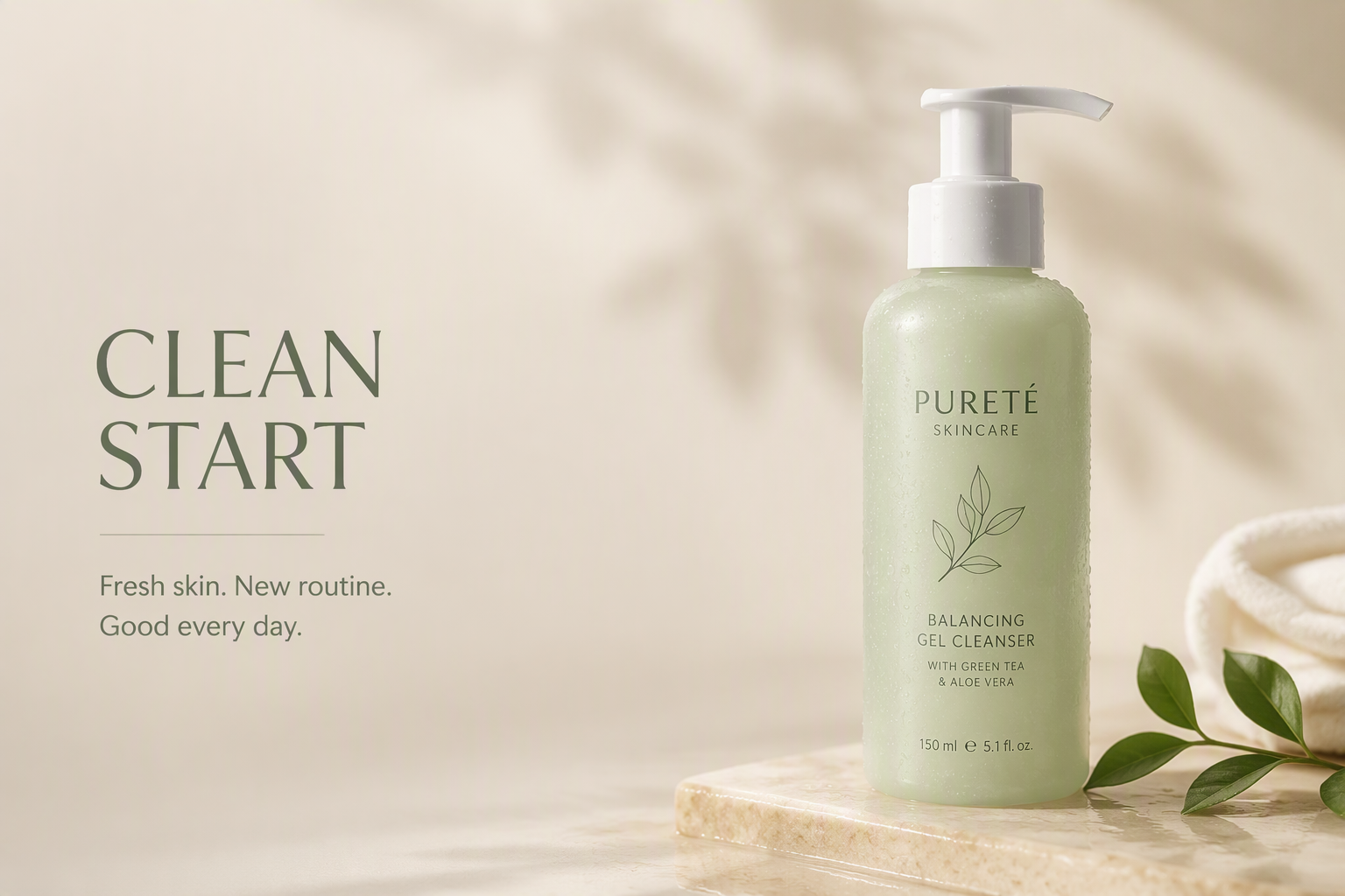
Soft CTA
Ship ad frames on Generate. Pair with logo concepts when the mark must stay vector-clean later.
FAQ
Multilingual text? Ask for one language per pass; don’t mix three scripts in one hero.
Tiny legal footnotes? Add in Figma—don’t force 6pt AI type.